
Reading Your Flight Report: A Worked Example from Tokoname to Kagoshima
This is a detailed breakdown of a flight report of a recent flight in the A320neo from Tokoname to Kagoshima, 396 nm in 66 minutes and the flight scored 89.04%.
It also ended with a 630 feet-per-minute arrival on runway 34, a GPWS warning on short final and the aircraft nearly 15 metres left of the centreline. A score is a summary. It can't tell you which of those things happened, or why.
The redesigned flight report is built to answer the why. When I wrote the tour of the rebuilt platform I described what each part measures. This post does something different: it takes one real report, top to bottom, and reads it the way I'd want you to read yours.
The header: the flight on one line
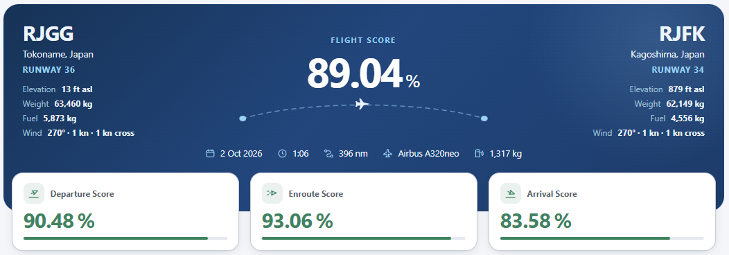
The header sets the scene before any judgement. Departure and arrival airports, the runways actually used, field elevation, the aircraft's weight and fuel at each end, and the wind. Underneath sit the date, block time, distance, aircraft type and fuel burned: 1,317 kg for this trip.
The conditions matter more than they look. Both ends had 1 kt of wind and 1 kt of crosswind. Whatever happened on the centreline at Kagoshima, the weather didn't do it.
Below the header, the overall score splits into three phases:
| Phase | Score |
|---|---|
| Departure | 90.48% |
| Enroute | 93.06% |
| Arrival | 83.58% |
This is the first place to look. The weakest phase is where your next flight's attention should go, and here it's clearly the arrival. The departure, at 90%, also hides something, which the next panel finds.
What went well, what held you back
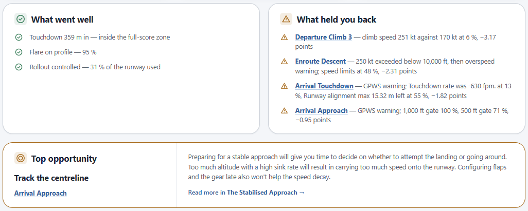
These two panels are the debrief in thirty seconds. The left lists what scored well. The right lists every deduction, ranked by how many points it cost, with the stage it came from and the measurement behind it.
On this flight the right-hand panel read:
| Stage | What happened | Cost |
|---|---|---|
| Departure Climb 3 | 251 kt in the climb against a 170 kt target | −3.17 |
| Enroute Descent | Exceeded 250 kt below 10,000 ft, then an overspeed warning | −2.31 |
| Arrival Touchdown | GPWS warning, −630 fpm, max 15.32 m left of centreline | −1.82 |
| Arrival Approach | GPWS warning, 500 ft gate only 71% | −0.95 |
Two things stand out. First, the biggest single deduction wasn't the landing at all. It was accelerating far too early on the climb out of Chubu, a fault you'd never have remembered by the time you reached Kagoshima. That's the case for scoring the whole flight rather than the last thirty seconds.
Second, three of the four items share a common theme: speed. Too fast in the climb, too fast below 10,000 ft, too fast on the approach. That's a pattern worth more than any individual number on the page.
Top opportunity
Under the two lists sits a single recommendation: the one change that would have recovered the most. Here it pointed at the arrival approach, with a link to The Stabilised Approach. If you only read one thing in the report, read this card.
The flight story: every stage, in order
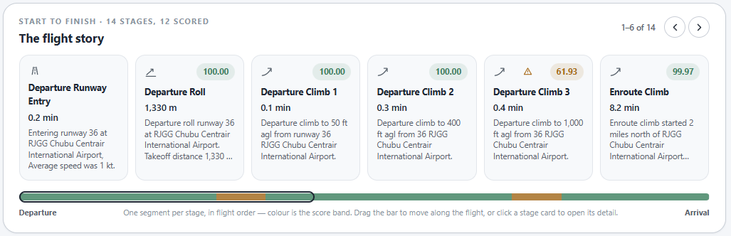
The flight story lays the flight out as a row of stage cards, from the moment the aircraft entered the runway to the end of the taxi in. This flight was split into 14 stages, 12 of them scored. Each card shows the stage name, how long it lasted, its score and a one-line description of what happened.
The departure shows why stages are worth the granularity:
- Departure Roll: 100.00, 1,330 m of runway
- Departure Climb 1 (to 50 ft): 100.00
- Departure Climb 2 (to 400 ft): 100.00
- Departure Climb 3 (to 1,000 ft): 61.93, with a warning flag
- Enroute Climb: 99.97 A perfect take-off, then a 24-second segment where it went wrong, then back to near-perfect. A single "departure score" would have smeared that into a vague 90%. The stage card tells you exactly which 600 feet to work on.
Under the cards is a progress bar with one segment per stage, coloured by score band. It's a heat map of the flight. Green is good, amber is where points went. Drag along it to move through the flight, or click a card to open the stage in detail. On this flight the amber sits in two places: early in the departure and late in the arrival.
Take-off and landing at a glance
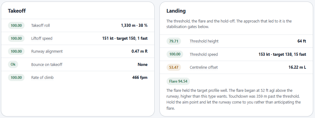
The next two panels pull the key measurements for each end of the runway into one place, each with its own score.
The take-off was clean: a 1,330 m roll using 38% of the runway, lift-off at 151 kt against a 150 kt target, 0.47 m right of centreline at rotation, no bounce and a 466 fpm initial climb. Every line scored 100. Whatever went wrong in Climb 3 happened after the wheels were up.
The landing panel is where the arrival starts to come apart:
- Threshold height: 64 ft against a 50 ft target, scored 79.71
- Threshold speed: 153 kt against a 138 kt target, 15 kt fast
- Centreline offset: 16.22 m left at the threshold, scored 53.47 High, fast and well off the centreline as the runway passed underneath. Below these sits the flare score, 94.54, with a short note. The flare held the target profile well but started at 52 ft, higher than the A320 wants, and the advice is to hold the aim point and let the runway come to you rather than anticipating the flare.
That's an interesting pairing. A good flare score alongside a 630 fpm touchdown tells you the flare itself wasn't the problem. The energy it had to deal with was. To see where that energy came from, you go back up the approach.
The stabilisation gates: where the landing was decided
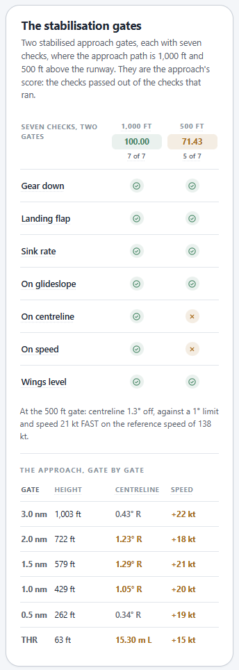
The report now checks seven things at two gates, 1,000 ft and 500 ft above the runway: gear down, landing flap, sink rate, on glideslope, on centreline, on speed and wings level. Each gate's score is simply the share of checks passed.
At 1,000 ft it passed all seven, 100%. At 500 ft it passed five of seven, 71.43%. The two failures were centreline (1.3° off against a 1° limit) and speed (21 kt fast on a reference speed of 138 kt).
Below the checklist is the approach gate by gate, from 3 nm out to the threshold:
| Gate | Height | Centreline | Speed vs ref |
|---|---|---|---|
| 3.0 nm | 1,003 ft | 0.43° R | +22 kt |
| 2.0 nm | 722 ft | 1.23° R | +18 kt |
| 1.5 nm | 579 ft | 1.29° R | +21 kt |
| 1.0 nm | 429 ft | 1.05° R | +20 kt |
| 0.5 nm | 262 ft | 0.34° R | +19 kt |
| Threshold | 63 ft | 15.30 m L | +15 kt |
This table is the most useful thing in the report, and it's worth reading slowly.
The speed column is the first finding. The aircraft was 22 kt fast at 3 nm and never fixed it. The 1,000 ft gate passed, but the excess was already there, and it never went away. Read alongside the descent overspeed earlier in the flight, this wasn't a one-off on final. It arrived at the approach with too much energy and spent the whole of it carrying that energy towards the runway.
The centreline column is the second, sitting right of centreline all the way down, drifting to 1.3° at 1.5 nm, corrected back to 0.34° at half a mile, then crossed the threshold 15 metres left. That's a late correction that didn't stop. It's the signature of chasing the centreline in the last few hundred feet rather than tracking it from further out, which is exactly what the Top opportunity card flagged.
A fast, unsettled approach handed the flare a problem it couldn't fully solve. This is what I mean when I say most bad landings are decided before the flare. The gates show it in numbers.
Touchdown: six numbers and two pictures
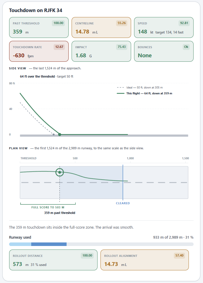
The touchdown panel opens with six tiles, each scored and colour-banded:
| Measure | Value | Score |
|---|---|---|
| Past threshold | 359 m | 100.00 |
| Centreline | 14.78 m left | 55.26 |
| Speed | 148 kt, 14 kt over target | 92.81 |
| Touchdown rate | −630 fpm | 12.67 |
| Impact | 1.68 G | 75.43 |
| Bounces | None | Ok |
The touchdown point was perfect. The rate was not. The tour post described the float-for-butter failure, where a fast approach is held off down the runway until it settles gently, long. This is the opposite trade, arriving just as fast, but putting the aircraft on the aim point anyway, and the excess energy came out as sink rate instead of runway.
Side view and plan view
Under the tiles are two drawings at the same scale. The side view shows the last 1,524 m of the approach: my path crossing the threshold at 64 ft and touching down at 359 m, against the ideal 50 ft path touching down at 305 m. The plan view shows the first half of the 2,989 m runway from above, with the full-score touchdown zone marked out to 503 m and my track drawn through it.
The plan view is where the centreline story becomes obvious. You can see the track arrive offset from the dashed centreline and stay offset through touchdown, rather than converging on it.
Rollout
The panel closes with the rollout, using 933 m of the 2,989 m runway, 31%, with a 573 m rollout that scored 100. Rollout alignment scored 57.40, finishing 14.73 m left. Having crossed the threshold off the centreline, the offset remained and carried into the touchdown and rollout.
Explore in detail
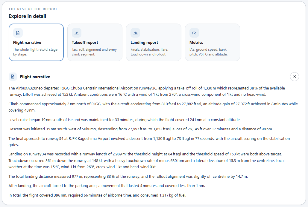
Everything above is the summary. At the bottom of the report, four cards open the full detail:
- Flight narrative: the whole flight retold stage by stage in plain English
- Takeoff report: taxi, roll, alignment and every climb segment
- Landing report: finals, stabilisation, flare, touchdown and rollout
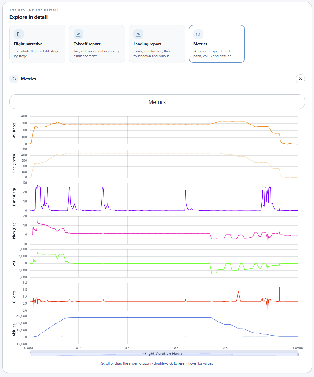
- Metrics: the raw traces for IAS, ground speed, bank, pitch, vertical speed, G and altitude The narrative is written from the recorded data and nothing else. For this flight it reads like a flight log: a climb from 810 ft to 27,882 ft in eight minutes, 33 minutes of level cruise covering 241 nm, a 17-minute descent from just under 28,000 ft, and a final approach from 1,150 ft to 73 ft above the runway in 77 seconds. It's a good way to see the shape of a flight you've half forgotten.
The Metrics card is for when you want to check a hunch. For this flight, the IAS trace through the descent is where I'd look next, to see how early the speed built up before the approach began.
A five-minute review routine
You don't need to read every panel after every flight:
- Phase scores. Which of departure, enroute and arrival was weakest?
- What held you back. What cost the most points, and do any items share a cause?
- Top opportunity. That's your one thing to change next flight.
- Stabilisation gates. If the arrival was weak, read the gate table before blaming the flare. Look at speed and centreline gate by gate.
- Touchdown tiles. Compare touchdown point with touchdown rate. A good number on one and a bad number on the other tells you where the energy went. For this flight, that routine gives a clear focus: fly the next approach on speed from 3 nm, and settle the centreline by 1,000 ft instead of chasing it at 200. If that's fixed, the touchdown rate should look after itself. I'll know whether it did, because the next report will tell me.
That's the point of all this. Not the 89%, but knowing which three numbers to change to make it 95.
Remember that an unstable approach should end in a go around, not a poor landing. Go arounds are automatically detected and handled in the final analysis, you can do as many as you need and they save you points!
Try it on your own flights
The flight report works the same way in MSFS 2024 and 2020, X-Plane 12 and 11, and Prepar3D. Install the Client Connector, fly as you normally would, and the report is waiting when you land. There's a 14-day free trial, no buttons to press and nothing to fill in.